In recent years, there has been an emphasis on clean, minimal, flat designs, which has led to most of the internet looking a bit samey. Well, get ready to break out of the routine because web design trends for 2022 are all about captivating audiences with storytelling, rich, vibrant imagery, movement, and unconventional typography and layouts. So, let’s take a peek at some web design trends for 2022.
1. “Scrolly-telling”
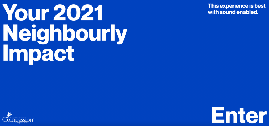
The word “scrolly-telling” is a combination of “scroll” and “storytelling,” and it is quickly gaining popularity. Scrolly-telling is when content is revealed or altered as the user scrolls through the page or section. It is a powerful way to engage the audience and tell stories more dynamically. Scrolly-telling is an innovative way to communicate information through text, animation, images, and design. Compassion’s site by ZN Studio Australia is a fantastic example of this technique in action.
2. Brutalist Typography (and Brutalism in general)
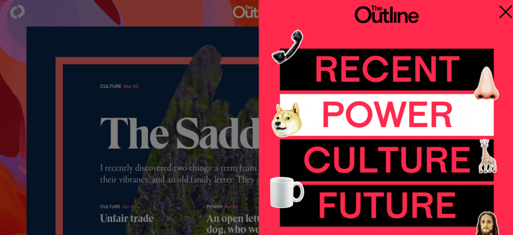
This trend has roots in the 1950’s brutalism architectural movement. Brutalist typography and web design are characterized by clashing colors and a raw, unpolished look. You could kind of think of this style as “anti-design” because of its disregard for conventional design principles. However, it is pretty tricky to pull off, as you need to break the “right” rules. Check out this great example from The Outline.
3. Kinetic Typography
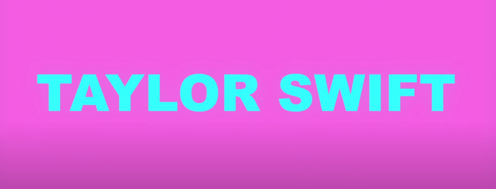
Kinetic typography is the technical term for moving text. This type of animation has been around for a long time, but recently it can be seen just about everywhere. Kinetic typography is excellent for capturing attention because it is engaging and it draws people into the moment. It also helps people retain information, so it is perfect for explainers. Here’s an example of kinetic typography in Taylor Swift’s music video “You Need To Calm Down.”
We help freelancers
With World in Freelance, you can find:
- Fully remote options – Work anywhere you want.
- Passion projects – Spend time on what inspires and excites you.
- Japanese language upkeep – Team up with top Japanese tech companies.
4. Fewer Hero Images
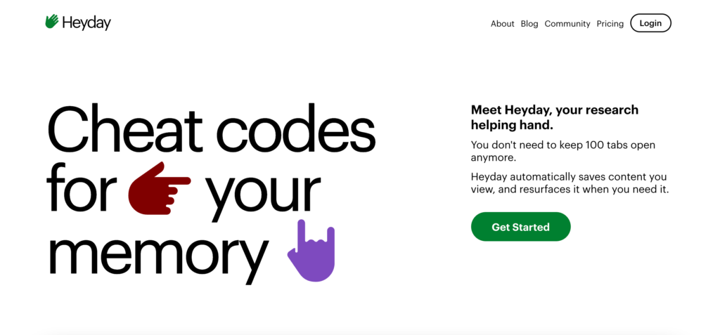
Many designers are opting to create hero section designs without the distraction of an illustration or photography, instead using design to communicate. Although hero images are visually impactful, some designers use typography and color to emphasize composition, design, and content. Take a look at how Heyday put together a beautiful, imageless hero section.
5. Inclusive Design
It seems that a lot more websites moving toward inclusive copy and accessibility in their designs. Most companies now have accessibility experts who focus on performing audits and creating solutions according to accessibility guidelines. This is great because inclusive design makes the internet a place that is more accessible to more people. To familiarize yourself with accessibility in web design, you can start here with the Web Content and Accessibility Guidelines.
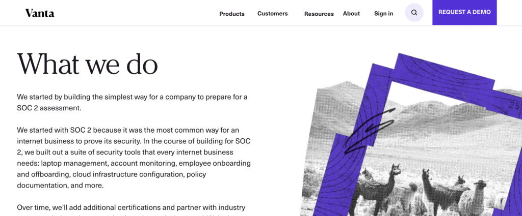
6. Collage Images
Collage illustrations can turn an ordinary website into something special and unique. Designers can play with white space, layering, distortion, and patterns with collage to give a more tactile feel. They can also incorporate imagery without making the photograph the sole focus of the image. Vanta did a great job with collage here that isn’t too over the top but still creates visual interest.
7. More Glassmorphism
We think the beautiful and reflective Glassmorphism trend will continue through 2022. This style uses diffusion, blur, light, and shadow to create an optical illusion with a glass-like effect. Adding movement enhances the impact further, and it can be used to create anything from mesmerizing logos to entire sections. Tyler Galpin’s glassmorphic logo is a perfect example of how glassmorphism + movement = wow.
Looking forward to seeing these trends in action
Based on these trend predictions, it looks like 2022 will be a big, bold year for web design with designers continuing to push the medium further and experiment with new styles. The team at Inbound Technology is looking forward to seeing what will be created this year.